Plotting an expression is similar to integrating an expression:
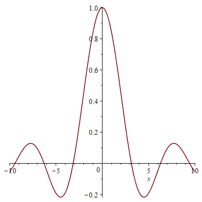
[> plot( sin(x)/x, x = -10..10 );
The first argument should be a mathematical expression depending on only one unknown variable, and the second argument must be that independent variable equated to a range.
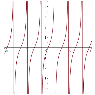
One point you will notice is that the scales on the two axes differ. For example, you know that $\tan(x) \approx x$ for small values of $x$, and yet, this plot makes the derivative of $\tan(x)$ appear to be greater than two:
[> plot( tan(x), x = -10..10 );
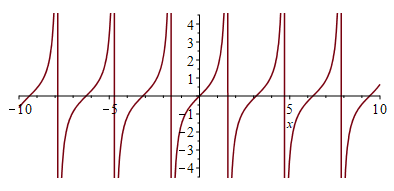
We will now introduce options that allow you to change the characteristics of the plot. We will start with ensuring that both the abscissa and ordinate (usually called the $x$- and $y$-axes, respectively) have the same scaling:
[> plot( tan(x), x = -10..10, 'scaling' = 'constrained' );
An option is always of the form 'option_name' = option-parameters. The default for the option scaling is 'unconstrained'. There is no significance to the order of options, but if an option is repeated, the last will be used. Options parameters are not always symbols, but we will describe some now:
The default color of a plot is red, but you can change the color of your plot by using the option 'color' = "ColorName", where the color name is any from the following list. The use of double quotes indicates a string, which we will discuss later, but strings in Maple are like strings in C++ or any other language. Some of these color strings, especially the more primary colors, can be prefixed by Dark, Medium or Light.
"AliceBlue"      "AntiqueWhite"  "Aquamarine"    "Azure"
"Beige"          "Bisque"        "Black"         "BlanchedAlmond"
"Blue"           "BlueViolet"    "Brown"         "Burlywood"
"CadetBlue"      "Chartreuse"    "Chocolate"     "Coral"
"CornflowerBlue" "Cornsilk"      "Crimson"       "Cyan"
"DeepPink"       "DeepSkyBlue"   "DimGray"       "DodgerBlue"
"Feldspar"       "Firebrick"     "FloralWhite"   "ForestGreen"
"Gainsboro"      "GhostWhite"    "Gold"          "Goldenrod"
"Gray"           "Green"         "GreenYellow"
"Honeydew"       "HotPink"
"IndianRed"      "Indigo"        "Ivory"
"Khaki"
"Lavender"       "LavenderBlush" "LawnGreen"     "LemonChiffon"
"Lime"           "LimeGreen"     "Linen"
"Magenta"        "Maroon"        "MidnightBlue"  "MintCream"
"MistyRose"      "Moccasin"
"NavajoWhite"    "Navy"
"OldLace"        "Olive"         "OliveDrab"     "Orange"
"OrangeRed"      "Orchid"
"PaleGoldenrod"  "PaleGreen"     "PaleTurquoise" "PaleVioletRed"
"PapayaWhip"     "PeachPuff"     "Peru"          "Pink"
"Plum"           "PowderBlue"    "Purple"
"Red"            "RosyBrown"     "RoyalBlue"
"SaddleBrown"    "Salmon"        "SandyBrown"    "SeaGreen"
"Seashell"       "Sienna"        "Silver"        "SkyBlue"
"SlateBlue"      "SlateGray"     "Snow"          "SpringGreen"
"SteelBlue"
"Tan"            "Teal"          "Thistle"       "Tomato"
"Turquoise"
"Violet"         "VioletRed"
"Wheat"          "White"         "WhiteSmoke"
"Yellow"         "YellowGreen"
For example,
[> plot( sin(x), x = 0..Pi, 'color' = "Olive",
         'scaling' = 'constrained' );
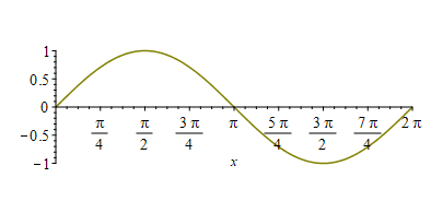
Note that Maple detected that you were plotting over an interval containing $\pi$, and therefore chose different, and more appropriate, axes labels.
The next option is adding a title to the plot. There are two approaches, and 'title' = "some string text" is the most straight-forward:
[> plot( tanh( x ), x = -3..3, 'color' = "ForestGreen",
         'scaling' = 'constrained', 'title' = "The hyperbolic tangent" );

You can, however, include mathematical expressions in your title, where you pass the typeset function a sequence of arguments that are either strings or expressions, and this will be processed and combined into a single title:
[> plot( exp(-x^2/2)/sqrt(2*Pi), x = -3..3, 'color' = "DeepPink",
         'title' = typeset( "The normal distribution ", 'exp(-x^2/2)/sqrt(2*Pi)',
	                    " on three standard deviations" ) );

There is also something else that is new: note that 'exp(-x^2/2)/sqrt(2*Pi)' also has single quotes around it, just like all the option names. This tells Maple to make only minor changes to the expression and not call functions like sqrt(...). For option names in quotes, if that symbol has been assigned to (there is no reason you cannot assign color := 1:), it is not evaluated to what it is assigned to. Most engineers will not use unevaluation quotes for more than the occasional option name.
By default, the axes try to go through the origin 'normal'. You can, however, request that the axes appear only on two sides ('framed'), on all four sides ('boxed'), or no axes ('none').
[> plot( sin(x), x = -2..2, 'axes' = 'boxed', 'color' = "Crimson" );

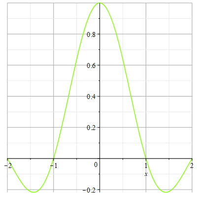
This option is by default false, but you can have gridlines appear in the background:
[> plot( sin(Pi*x)/(Pi*x), x = -2..2, 'gridlines' = true,
        'color' = "Chartreuse" );
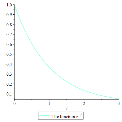
The relevance of a function can be specified in a legend, and we will see that we can combine multiple plots in a single plot, so legends will allow users to identify each of the functions. The parameter of a legend is either a string or a typeset(...) function as with the option title.
[> plot( exp(-t), t = 0..3,
         'legend' = typeset( "The function ", exp(-t) ), 'color' = "Aquamarine" );
To add two more more plots into a single plot, we use the plots[display] function, to which we can pass zero or more plots as arguments. The interesting name comes from the design that plots is a package (akin to a library), and display is a function in this package.
[> plots[display](
   plot( ChebyshevT( 0, x ), x = -1..1,
         'legend' = "The 0th Cheybshev polynomial.", 'color' = "CornflowerBlue" ),
   plot( ChebyshevT( 1, x ), x = -1..1,
         'legend' = "The 1st Cheybshev polynomial.", 'color' = "Plum" ),
   plot( ChebyshevT( 2, x ), x = -1..1,
         'legend' = "The 2nd Cheybshev polynomial.", 'color' = "VioletRed" ),
   plot( ChebyshevT( 3, x ), x = -1..1,
         'legend' = "The 3rd Cheybshev polynomial.", 'color' = "Salmon" ),
   plot( ChebyshevT( 4, x ), x = -1..1,
         'legend' = "The 4th Cheybshev polynomial.", 'color' = "SeaGreen" ),
   'scaling' = 'constrained'
);

As you will note, you can also pass options to the plots[display] function, and those options will be applied to all of the plots.