- ECE Home
- Undergraduate Studies
- My Home
- Presentations
- Guidelines

Restricting colours in a presentation to black, white, and shades of grey will—quite literally—yield a monotone result and will consequently bore an audience; however, too much colour will also negatively impact a presentation. We will examine a number of issues related to colour and its application to visual aids. Whether colour is used for a background or simply for highlights and accents, colour should complement the visual aids and not detract from the presentation.
We will focus on a description of colour, or hue, however by increasing the amount of white or black (tinting or shading), it is possible to extend the number of possible colours. To do this, we will consider the following topics:
While engineers tend to use either additive primary colours (red, green, and blue) or subtractive primary colours (cyan, magenta, and yellow), the arts tend to use the more traditional primary colours red, yellow, and blue shown in Figure 1.
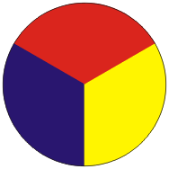
Figure 1. The primary colours.
By mixing these, we get three secondary colours: orange, green, and violet shown in Figure 2.
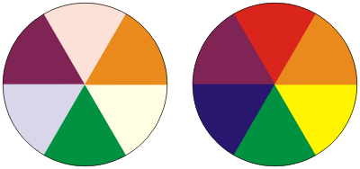
Figure 2. The secondary colours.
Combinations of neighbouring primary and secondary colours results in a further six tertiary colours shown in Figure 3. These will be named using the form primary-colour—secondary-colour.
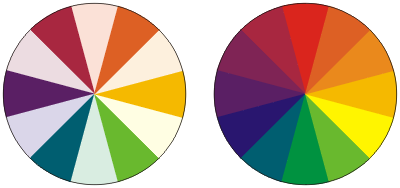
Figure 3. The six tertiary colours.
While the majority of people can differentiate twelve colours shown above, certain individuals have a restricted ability to differentiate these colours. Human vision is able to detect light with wavelengths ranging from 380 nm to 700 nm. Rather than simply recognizing intensity on this range, the eye has three types of cones (light receptors) each of which is sensitive to different sub-ranges of wavelengths, as shown in Figure 4.
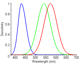
Figure 4. Representation of normal response to wavelengths of light.
An individual without, for example, the red cones is said to have protanopia and consequently colours normally viewed as red may be thought of as appearing as a hues of green. This is shown in Figure 5.
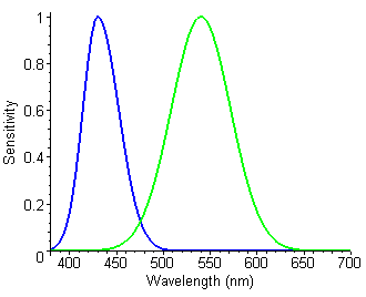
Figure 5. Representation of the response to wavelengths of light with protanopia.
Another possibility is for an anomaly in the red cones which causes them to respond to wavelengths similar to those responded to by the green cones. This reduction in the separation results in a lower ability to differentiate between what is considered to be red and green. In this case, reds and greens may be thought of as both appearing as hues of yellow. This is shown in Figure 6.
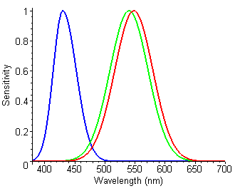
Figure 5. Representation of the response to wavelengths of light with protanomaly.
Similar problems with the green receptors are termed deuteranomaly and deuteranopia, respectively and with the blue cones are termed tritanomaly and tritanopia, respectively. The most common (7-10% of all humans) affect the red and green cones all of which contribute to what is termed red-green colour-blindness. Less than 0.01% of humans have problems with the blue cones, however, this too should be taken into account.
A colour scheme which uses black, white, and shades of grey is said to be monotone. Such a scheme will look professional, however, it will also dull the attention of the audience and detract from the visual aids. A monotonic scheme together with highlights using either a
colour scheme will both look professional and keep the attention of the audience. The ECE Department web site uses a monotone scheme with monochromatic (deep red) highlights.
Each colour may be associated with a temperature, usually warm or cool. Figure 7 shows the primary, secondary, and tertiary colours into warm and cool categories. The atmosphere of the presentation will be affected by your choice of colours.
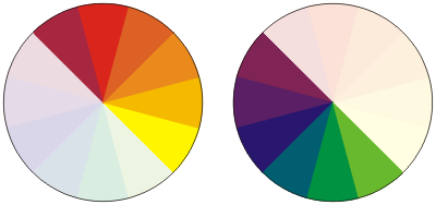
Figure 7. Warm and cool colours.
If you choose to have white slides with black text and intend to use only one other colour for highlights, consider using a colour which sets the appropriate mood.
Another option is to choose either tints or shades (by adding white or black, respectively) with a single colour. Figure 8 shows tints and shades of the primary and secondary colours.
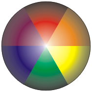
Figure 8. Tints and shades of the six primary and secondary colours.
Colours which are closely related to each other on the colour wheel are said to be analogous or harmonious. These colours tend to appear to work well together, however, consider Figure 9 which shows all triplets of harmonious colours.

Figure 9. Sets of harmonious triplets.
While triplets may be harmonious, one should also note that certain sets may be very dark (e.g., the blue— or blue-violet—centred triplets) or too light (e.g., the yellow— or yellow-orange—centred triplets). In this case, to maintain contrast, it would be better to modify some of the colours by using either tinting or shading.
Colours which are further apart on the colour wheel are said to contrast and the further apart colours appear on the wheel, the stronger the contrast. Contrast is very useful for making text appear more legible; however, this can also be achieved through tinting and shading. Using significantly different hues to achieve contrast is beneficial for singular items which require the immediate attention of the audience; however, consistent use may lead to fatigue on the part of the audience and will therefore significantly detract from a presentation.
There are two specific combinations of contrasting colours which we will examine:
Two colours which lie 180 degrees apart on the colour wheel are said to be complementary. These are shown in Figure 10.
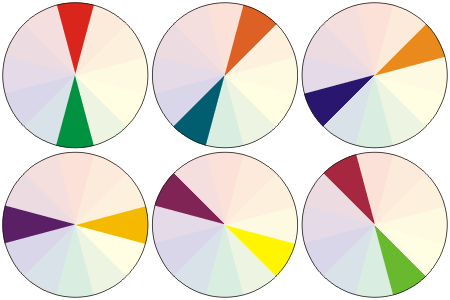
Figure 10. Complementary colour schemes.
Split-complementary colours are defined as triplets of colours where two colours are adjacent to the complementary colour of the other. In general, complementary and split-complementary colours will clash and visual aids which use these combinations will quickly draw the ire of the audience. Figure 11 shows a colour, its complementary colour, and its two split complementary colours. While the contrast is significant, they also clash.
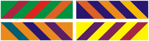
Figure 11. Demonstrations of complementary and split-complementary colours.
In Figures 12 and 13 demonstrate contrasting colours. Placing two contrasting colour adjacent to each other is, for the most part, undesirable; however, separating contrasting colours—and using the cooler colour for text— is more pleasing.
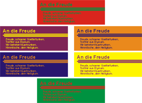
Figure 12. Adjacent complementary colours.
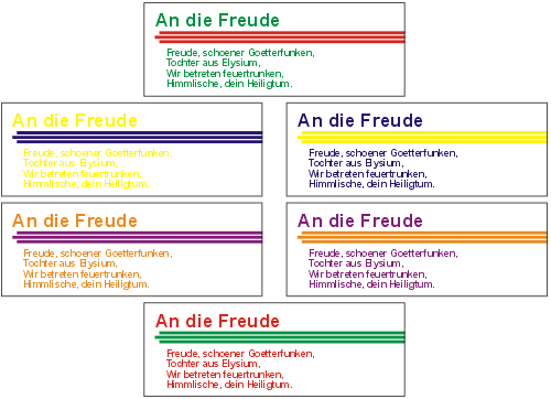
Figure 13. Complementary colours separated by white.
The three colours at 120 degrees separation on a colour while are said to form a colour triad. Again, such significant contrast will cause fatigue, but if your visual aids make significant use of two colours 120 degrees apart (to achieve contrast), periodic highlights could be done in the third colour of a triad. Figure 14 shows the various colour triads.
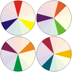
Figure 14. Colour triads.
Figure 15 demonstrates how colour triads may be used with highlights. The primary and secondary colour triads (top left and right, respectively) are more vivid.
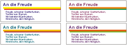
Figure 15. Colour triads separated by white.
Figure 16 uses colour triads in various combinations to demonstrate how these may be used together. In general, the lighter and darker colours are used to contrast the text and the background while the third colour is used for the highlight.
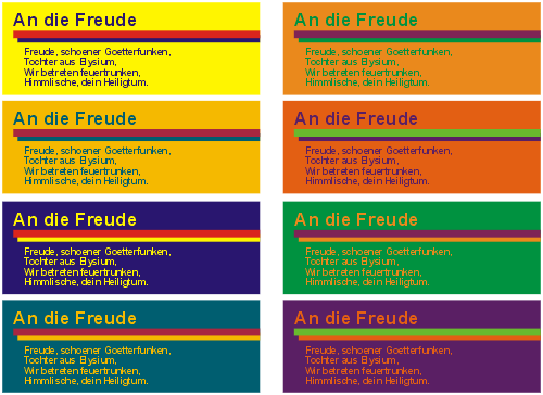
Figure 16. Colour triads used adjacently.