- ECE Home
- Undergraduate Studies
- My Home
- Presentations
- Guidelines

Note: this section is under construction. It requires a number of sub-sections discussing such various topics as time-series graphs, chartjunk, etc.
Graphs and charts are excellent qualitative means of representing the significance of quantitative data. The audience will be able to interpret more quickly and remember much longer a visual graph or chart as compared to the equivalent data presented as a table of numbers.
This page is under construction; however, in time, I will attempt to show a set of best practices for each of the charts and graphs available.
The requirements for a graph or chart in presentation are significantly different from the requirements for a publication:
It is a natural response for most inquisitive minds to look for patterns as soon as any chart or image. The presenter should have a full understanding of all trends which are apparent in any graph or chart.
A pie chart is an appropriate means of representing percentages of a whole. Figure 1 shows a pie chart created from the BP Statistical Review of World Energy, 2007. You may notice that the choice of colours significantly affects the perception: coal and oil are darker colours, natural gas is a light blue which is representative of the flame, nuclear energy is green (others may have coloured this section red), and hydro electricity is a deeper blue.

Figure 1. World Primary Energy Consumption by Fuel Type, 2006.
Unless there is a strong reason otherwise, start at 12 o'clock and move clock-wise from the largest percentage to the smallest, in order (unless there is a category "others", in which case, this should go last).
For now, I will list other types of charts and graphs.
A plot of a function is appropriate when one variable depends on another. If the dependent variable is continuous (height), then a line chart is certainly appropriate; however, if the dependent variable is discrete, a line chart is appropriate only if:
A bar chart is appropriate to plot quantity when the items on the ordinate axis are independent.
A histogram is a bar chart where the ordinate is associated
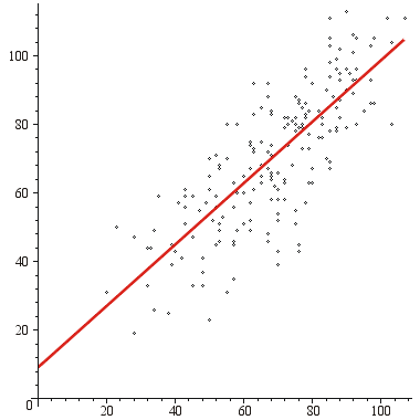
Figure 2. Mid-term examination grades versus final examination grades in ECE 250.