- ECE Home
- Undergraduate Studies
- My Home
- Presentations
- Guidelines

Under Construction
A time-series plot of, for example, closing stock prices of the RIM corperation, gives full information about the behaviour of the stock.
Figures 10, 11, and 12 show bar charts which take averages of the closing price over the Calendar Year, the Canadian Fiscal Year (April-March), and the American Fiscal Year (October-September).
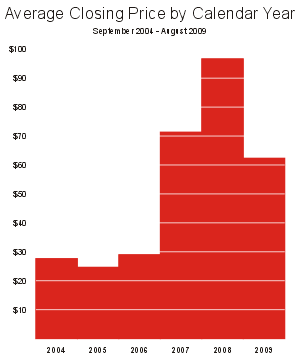
Figure 10. Closing price averaged over the calendar year.
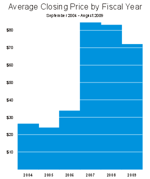
Figure 11. Closing price averaged over the Canadian fiscal year.
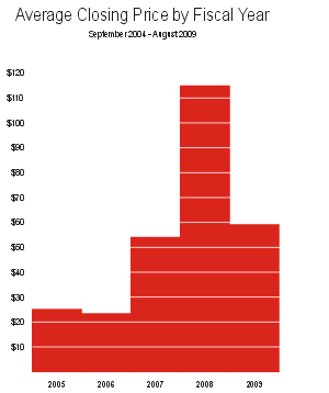
Figure 12. Closing price averaged over the American fiscal year.
Of these three plots, Figure 12 appears to be the most damning, even if all of the data has the exact same source. In Figure 12, there is a spike close to $120; while in Figure 11, the stock appears to be significantly more stable—yes, there was a downturn, but it does not appear to be as significant as other corperations.
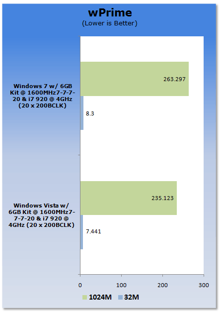
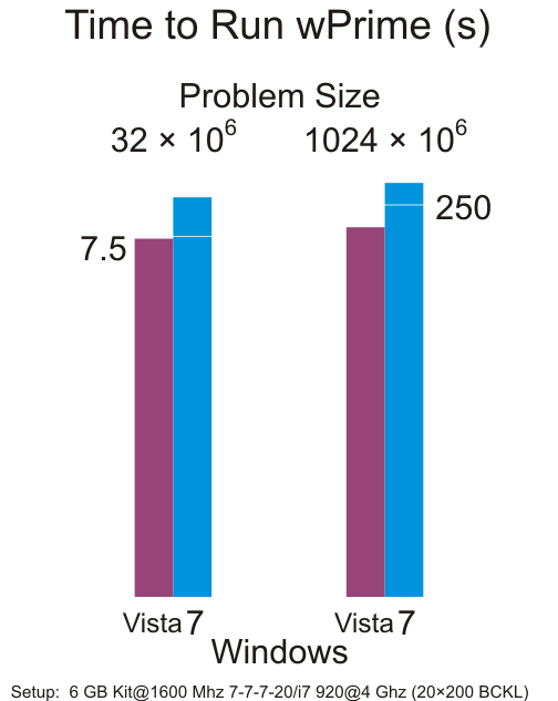
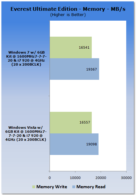
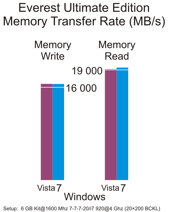
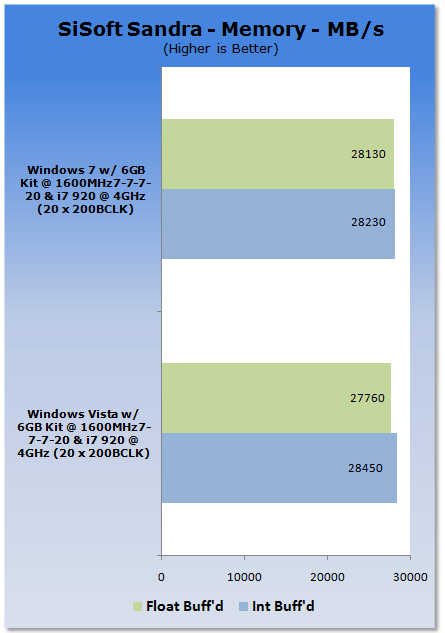
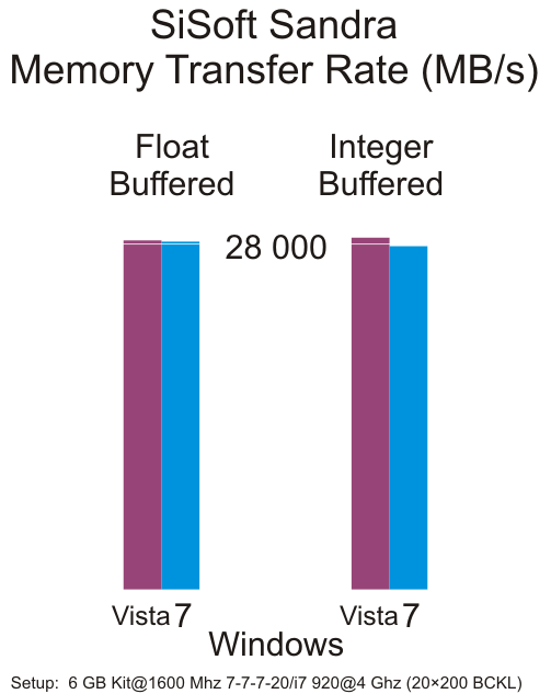
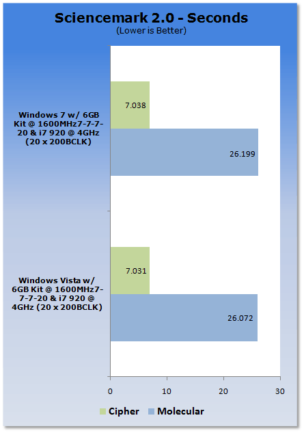
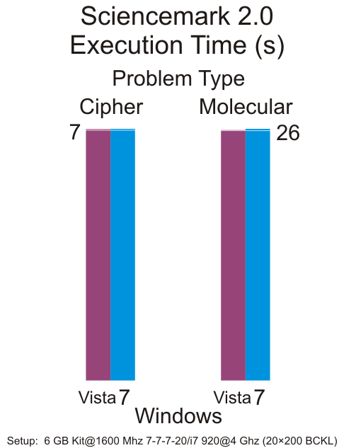
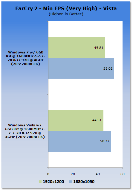
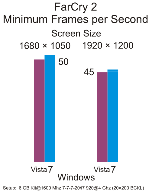
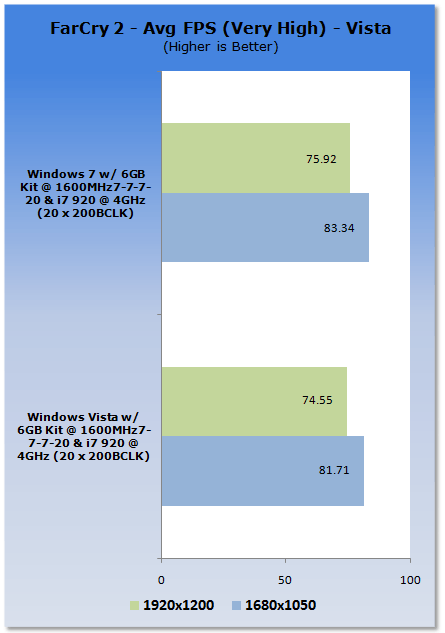
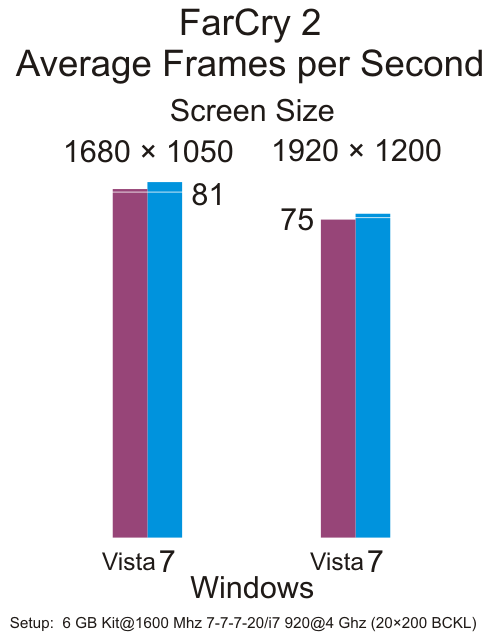
On the left are six bar charts from this site while on the right are bar charts showing the same data. Explain the differences.
| Original | Alternative |
|---|---|
 |  |
 |  |
 |  |
 |  |
 |  |
 |  |
Issues you may have noticed: