- ECE Home
- Undergraduate Studies
- My Home
- Presentations
- Guidelines

A pie chart is an appropriate means of representing percentages of a whole: each part is represented by a slice equal to the proportion of the part. Such a chart is useful to demonstrate overall proportions; it is not, however, acceptable to represent proportions where the relative difference is significant. A bar chart is more appropriate in this case.
To demonstrate the use and misuse of a pie chart, we will use statistics taken from BP Statistical Review of World Energy, 2007.
Figure 1 gives a good demonstration of how a pie chart may be used to represent the given data.

Figure 1. World Primary Energy Consumption by Fuel Type, 2006.
Figure 2 demonstrates some of the guides which were used to create Figure 1.
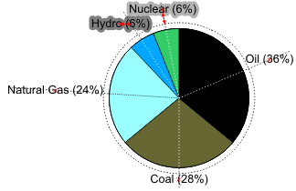
Figure 2. World Primary Energy Consumption by Fuel Type, 2006.
A brief summary of the various features shown in Figure 2 are listed here:
To address the two issues brought up in this list, an alternate form of Figure 1 is shown in Figure 3.
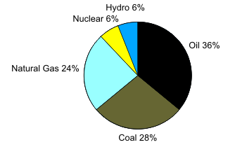
Figure 3. World Primary Energy Consumption by Fuel Type, 2006.
Next, we will look at a number of means of misrepresenting data using pie charts.
Do not attempt to break a pie chart into two to demonstrate two competing concepts. In Figure 4, the sources are broken into non-carbon-based and carbon-based sources. It is difficult for the audience to correctly estimate the relative areas: very few individuals would be able to accurately deduce that the left circle is 14% the area of the right circle. According to Tufte [2001], the proportion could be as small as 11% or as large as 37%.
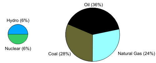
Figure 4. World Primary Energy Consumption by Fuel Type, 2006.
Such a dual pie chart would be useful if one wanted to overstate the proportion of non-carbon sources.
Slices should be ordered from largest to smallest following either a clockwise or counterclockwise direction usually from 12:00. In some cases it may be more appropriate to centre the largest slice around 12:00. An alternate order may in specific cases make sense; however, there must be appropriate justification for such a deviation.
The one exception is any slice collating the remaining percentages under the blanket name others. This should appear at the end, as it represents a number of slices hopefully smaller than the smallest slice explicitly shown.
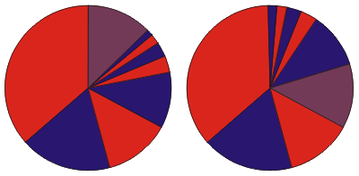
Figure 5. Ordering of slices.
Figure 6 shows a common means of focusing attention on a subset of the slices; specifically, the non-carbon-based sources. Here the two slices are separated from the pie in a technique often referred to as exploded.
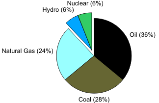
Figure 6. World Primary Energy Consumption by Fuel Type, 2006.
Unfortunately, this increases the already difficult task of estimating the differences. Because the slices are further out, this may over-represent the proportion of these slices.
If exploded pie slices must be used, the should be exploded along the bisector of the slice as is shown in Figure 7.
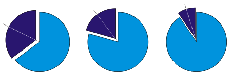
Figure 7. Exploding pie slices along the bisector.
Figure 8 takes exploding to the extreme: each slice is exploded. In Figure 6, the two slices of interest are simply shifted away from the center. Unfortunately, this technique does not generalize: each slice cannot be moved from each other slice in a uniform manner to maintain a constant distance from adjacent slices. The only way in which such a pie chart could be created would be to add a uniform white stripe between each pair of slices. This, unfortunately, diminishes the areas of the smaller slices in relation to the larger slices. To maintain the proportions of the areas, one would have to change the proportions of the angles.

Figure 8. World Primary Energy Consumption by Fuel Type, 2006.
An attempt to explode multiple pie slices along bisectors, as is shown on the left of Figure 9, fails; and an attempt to equally space multiple pie slices, as is shown on the right of Figure 9, also fails. The image on the left looks ill-proportioned while the image on right looks uneven: the circle around the slices is not continuous.
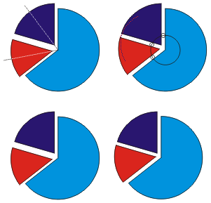
Figure 9. Attempts to explode multiple slices.
However, exploded pie charts can be summarized most easily as chartjunk on a grand scale.
A hairline border between pie slices helps distinguish the slices. A thick border, as shown in Figure 10, has the same effect as the exploded pie chart, it diminishes the area of the smaller slices, but also distracts the audience from the representation.
Figure 10. World Primary Energy Consumption by Fuel Type, 2006.
Figure 11 demonstrates a common technique which first appears to be artistic but in actuality is used to over-represent certain slices. The slice representing coal still occupies 28% of the top of the cylinder (compressing the image in one dimensions affects all areas equally); however, the height of the edge was specifically chosen to double the visible brown region.
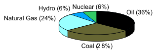
Figure 11. World Primary Energy Consumption by Fuel Type, 2006.
Again, such a pie chart would only be used to overstate the proportion of certain pie slices.
Figure 12 shows a number of errors: the colours are not appropriate, the lines connecting the text and the slices are unnecessary, and the order of how the slices appear is essentially random.
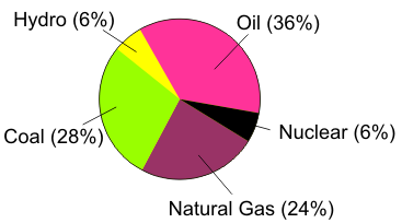
Figure 12. World Primary Energy Consumption by Fuel Type, 2006.
In Figure 1, the centre line was used to demonstrate that the energy consumption based on oil equaled to energy consumption based on natural gas, hydro, and nuclear together. One observation which could be made is that oil combined with hydro and nuclear produces approximately 50% of the world's energy; however, this is a pointless observation.
Placing any text on the pie slices disrupts the image and makes comparisons more difficult. Figure 13 demonstrates how in some cases it is impossible to annotate slices uniformly which leads to a mixture of conventions.
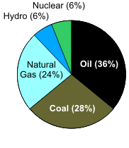
Figure 13. World Primary Energy Consumption by Fuel Type, 2006.
Keep the information and the chart separate.
Figure 14 attempts to look more professional by including a legend as opposed to labeling the individual slices. This separation makes a discontinuity between the labels and the slices. The audience must constantly refer to the legend to understand the pie chart.
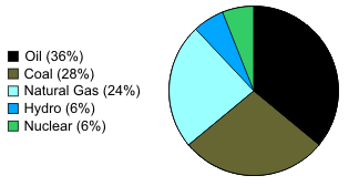
Figure 14. World Primary Energy Consumption by Fuel Type, 2006.
Use the chart to display the data; do not separate the image from any associated text or annotations.
We will now look at two examples of pie charts which have a large audience: the ubiquitous "Understanding Gas Prices" sticker found on all pumps at Petro-Canada stations and an example of a pie chart found on Wikipedia.
Figure 15 shows a sticker attached to most pumps at Petro-Canada gasoline stations together with a more reasonable representation using the suggestions above.
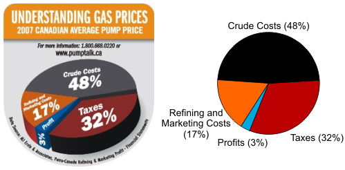
Figure 15. "Understanding Gas Prices" and a better representation.
The artist appears to use an exploded pie slice together with a 3-dimensional effect; however, rather than simply compressing the pie chart in one direction, the artist rotated the major axis. The font sizes of the "48%" and the "32%" are equal, but the font sizes of the "17%" and the "3%" are relatively smaller. The "3%" is also used to obscure the vertical component of the "Profit" pie slice. What is unfortunate is that the more straight-forward representation conveys the same information.
Unfortunately, this is not the end of the story: the sticker misrepresents the data. The first clue is that 48% is very close to 50%; however, the "Crude Costs" slice appears to have an angle significantly less than the expected 172.8o. When the outline of the pie chart shown on the right of Figure 15 is superimposed, scaled, and rotated on the sticker, the misrepresentation becomes clear. This superimposition is shown on the left of Figure 16. The pie chart on the right of Figure 16 shows the best approximation of the author to transform the pie chart shown in the sticker to a more standard representation. The white lines indicate the actual transformation while the underlying pie chart is a reasonable approximation. The percentages around the border represent the actual proportion of the angles. Two interesting facts become clear: the area of the Profit slice appears to be 4% and not 3%, and the 6% of the Crude Costs have been transferred to Taxes. While the increase in the size of the Profits does not work to the advantage goal of the organization; the increase to the taxes is much more significant and much more advantageous. The source of the image is the web site www.pumptalk.ca which is referenced on the sticker.
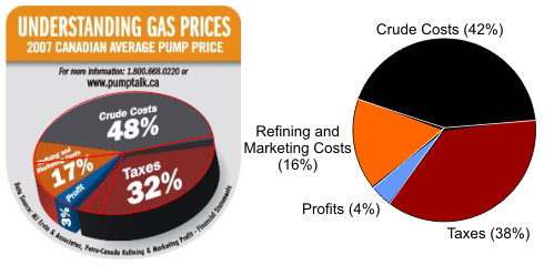
Figure 16. Misrepresentation in "Understanding Gas Prices".
Another serious issue with the pie chart is that they are using a 3-dimensional view where the Taxes slice is most visible. If you consider just the visible area of the chart, Table 1 gives the proportions of the visible area.
Table 1. A comparison of the proprotions.
| Component | Stated Proportion | Proportion of Actual Pie Slice | Proportion of the Image |
|---|---|---|---|
| Crude Costs | 48% | 42% | 33.5% |
| Taxes | 32% | 38% | 45.8% |
| Refining and Marketing Costs | 17% | 16% | 13.6% |
| Profits | 3% | 4% | 7.0% |
The objective is clear: taxes which account for 32% of the costs are given 38% of the surface of the pie and, with the 3-dimensional effect, occupy 45.8 percent of the visible area: an increase of 43%. The only possible mitigating factor may be that the visible area of the profits wedge is 133% larger; however, I would claim that the point is clearly made: the goal, whether conscious or subconscious, through disproportionate areas, colour, and the 3-dimensional chart was to maximize the appearance of the taxes.
Perhaps in 2008, the organization could consider revising the sticker to something similar to the examples shown in Figure 17. The example on the left is, with a deliberate choice of colours, as absurd as the original; however, the example on the right may almost be considered to be honest.
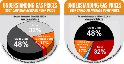
Figure 17. Suggested sticker modifications.
The example shown in Figure 18 is given on the wikipedia page on pie charts.
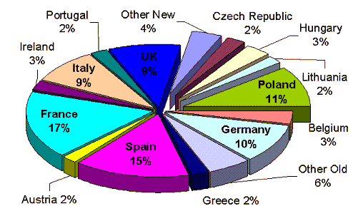
Figure 18. Percentage of EU Farm Land by Country in 2004.
There appears to be no justification for the order of the countries; it is an exploded 3-dimensional pie chart where some of the slices (those representing newer EU countries) are further exploded, and a mix of annotations together with additional chartjunk is used (the text on the UK slices is almost lost in the blue).
Figure 19 shows a more standard pie chart. There are too many countries to give each country a separate colour; consequently, as the focus appears to be comparing older EU countries versus newer EU countries, shades of blue are used for the former while shades of violet are used for the latter. Green was not used as it represents soil fertility and to use green on one side would suggest the other side is less fertile. Red was not used to avoid any negative reference to any former Soviet-block status. Colours are alternated and the order of the countries goes from largest percentage to smallest starting at 12 o'clock. The "others" are collected together at the end and are given a deeper colour. The use of words such as "old" and "new" is inappropriate; as Romania is not listed, this would suggest that the graph compares pre-2004 entrants and 2004 entrants into the EU.
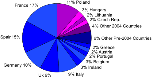
Figure 19. Percentage of EU Farm Land by Country in 2004.
The alternate view, also uploaded to wikipedia, shown in Figure 20, suffers from similar problems; most notably the use of the similar colours which are not adjacent, e.g., Italy and Greece, and Spain and Portugal. This may even suggest that countries in the same region have similar shades; however, this is not the cases as the UK and Ireland are yellow and pink, respectively. The audience is left attempting to determine a pattern where no pattern exists. More odd is the nesting of the 2004 Countries in the middle of the menu between UK and Belgium. The choice of colours includes orange, red, rose, purple, and blue where Others (New) (orange) has a colour which associates it more with the UK slice (yellow) and Poland (blue) has a colour which associates it more with the Belgium slice (turquoise).
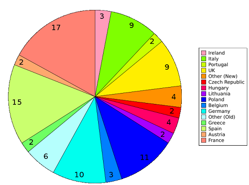
Figure 20. Percentage of EU Farm Land by Country in 2004.
One could suggest that such data would be more accurately represented as a bar chart; however, consider Figures 21 and 22 which use some of the best practices for bar charts. There is no unnecessary chartjunk; yet in neither case is it easy to deduce what proportion of EU farm land is associated with the 2004 EU countries, and one glaring problem is readily noticed: the data is too course for a bar chart as numerous countries appear to an identical amount of farm land when in reality this is most certainly misleading. A bar graph should have a precision of at least one hundredth the size of the largest bar; in this example, that resolution would be approximately 0.1%.
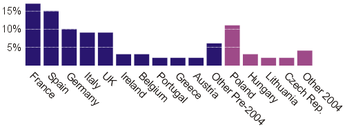
Figure 21. Percentage of EU Farm Land by Country in 2004.
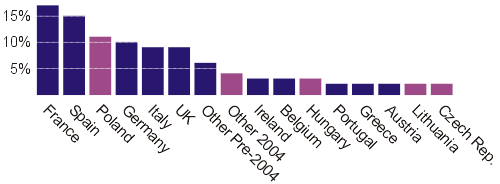
Figure 22. Percentage of EU Farm Land by Country in 2004.
The author would challenge anyone to suggest a better representation of the data shown in Figure 19.
To conclude, a pie chart is an appropriate means of showing proportion; however, it should be used in its simplest manner with appropriate use of colours and annotations. Additional features will in general make it more difficult for the audience to see the significance of the quantitative data. Pie charts should not be used where differences are significant; however, generalizations that pie charts are unacceptable as a means of representing data should be taken with a grain of salt.