- ECE Home
- Undergraduate Studies
- My Home
- Presentations
- Guidelines

The more general choice of typeface for a presentation and the more specific choice of fonts is surprising significant when preparing visual aids. The fonts should be simple and of an appropriate size for the entire audience to read. A font is a instance of a typeface.
To begin, there are four common general categories of typefaces, including:
Serifs are additional ornaments added to characters and any typeface with these ornaments falls in this category. Typefaces without serifs but which are still mechanical are termed sans-serif. Figure 1 shows the letter E in a serif and a sans-serif font.

Figure 1. The letter E without serifs (left) and with with serifs (center and right).
A cursive font is one which appears or attempts to appear to be hand written. The last category, monospace is more of a specialization: a monospaced font gives each glyph (a character, number, or punctuation mark) the width. Most monospaced typefaces are use serifs.
A typeface is a collection of related fonts. Associate with each typeface is one or more fonts and the four most commonly associated fonts are regular, italic, bold and bold-italic. The following are all typefaces, one from each of the above categories, respectively:
Figure 2 demonstrates the regular font of each of these typefaces together with three lines: the baseline, the median, and the cap line. The serifs may be noted to, in general follow the direction of the lines and thereby aid in reading small text.
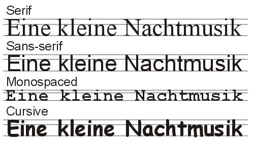
Figure 2. Text in specific regular fonts of each of the four categories.
We will consider all four typefaces and the most commonly available fonts.
Times New Roman is the most common serif typeface. Figure 3 shows the four most common fonts in this typeface. Unfortunately, the serifs which make this a good font for texts also make it inappropriate for slides. The average page of a text book may have 500 words. A slide which contains 50 words is already likely too dense. A slide contains so few characters that the serfs become distracting.
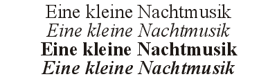
Figure 3. Times New Roman.
One place where Times New Roman is commonly used, even on slides, is with mathematical equations. This is discussed in Section 5.5.1 Equations.
One popular alternative is an entire family of serif typefaces given the blanket name Computer Modern. These were design by Donald Knuth when he wrote the TeX document processing language.
Arial is a common and appropriate sans-serif typeface. The letters are of uniform width and are easily read form a distance.

Figure 4. Arial.
Figure 5 demonstrates another advantage of Arial: the strokes are all approximately the same width. The thin horizontal strokes of Times New Roman make it more difficult to read at a distance.
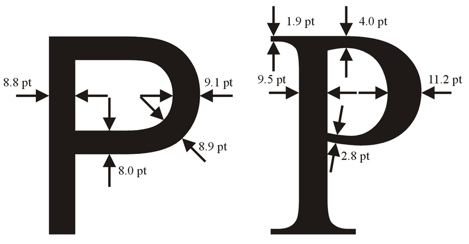
Figure 5. Comparing the structures of the character 'P' in both Arial and Times New Roman.
While in Iceland, the author was looking for a guesthouse named Randaberg just outside the city of Egilsstaðir—a pleasant stay once we found it. Unfortunately, they had updated the sign coming out of the town with a black-on-white all-caps Times New Roman font. Across the road was a guesthouse with a more traditional sans serif font which caught our attention. It was only when we came back that the name of the guesthouse jumped out at us: on the other side, they had a white-on-black arial font. This can be observed in Figures 6 and 7. Take six steps away from your monitor to determine which is more clear when seen from a distance. Figure 7 was shrunk 25% to account for the difference in font width.

Figure 6. The less clear sign seen coming out of town outside the Randaberg Guesthouse.

Figure 7. The more clear sign seen coming into town outside the Randaberg Guesthouse.
Comic Sans, shown in Figure 8, does not have an italic or bold-italic font. It is not an appropriate typeface for a technical presentation, however, it is included here simply because the author has seen numerous presentations on the web which explicitly use this font.

Figure 8. Comic Sans.
Courier New, shown in Figure 9, is is a typeface appropriate for displaying code, however, it is preferable to use the bold font rather than the regular. The regular font is too thin.
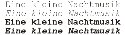
Figure 9. Courier New.
There are thousands of available typefaces, however, not all are installed on all computers. For a presentation to be portable, it must use standard fonts. Some alternative fonts are shown in Figure 10, one from each of the three appropriate categories while Figure 11 shows some common but undesirable fonts. It has been suggested by some that Lucida Console is more appropriate for displaying code, however, this is all a matter of personal taste.
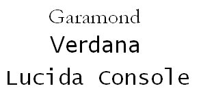
Figure 10. Three alternate fonts.
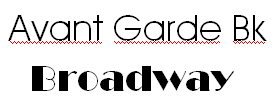
Figure 11. Two inappropriate fonts..