

Example 1
Figure 1 shows data which comes from an exponentially decaying function.
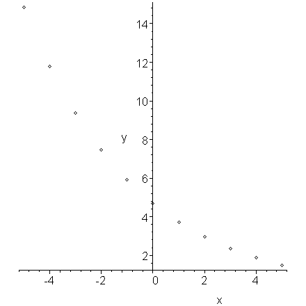
Figure 1. Exponentially decaying data.
If, for each x, we plot the logarithm of its associated y value, we get the plot in Figure 2 which is clearly linear.
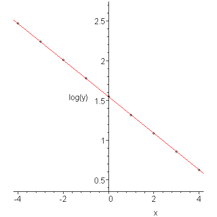
Figure 2. The logarithm of exponentially decaying data.
The data in Figure 1 comes from the function y = 4.7e-0.23x. The slope of the line (-0.23) in Figure 2 equals the rate of decay.
Example 2
Figure 3 shows data which is growing as a power of x, that is, y(x) = axb. Note that it must pass through the origin.
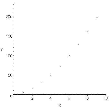
Figure 3. Data displaying power growth.
If we plot the logarithms of the x values versus the logarithms of the y values, we find that the points lie on a straight line.
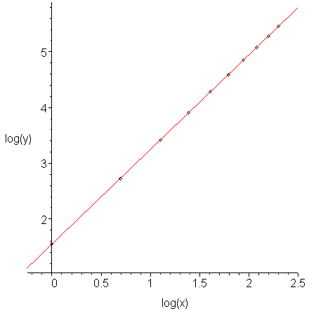
Figure 4. The log-log plot of data which displays power growth.
The data in Figure 3 comes from the function y = 4.7x1.7. The slope of the line (1.7) in Figure 4 equals the power.
Comment: you may hypothesize that the data in Figure 3 appears to be quadratic. We could try fitting a quadratic curve to this data, as is shown in Figure 5, however, we note that it is not as good a fit as the form which we found.
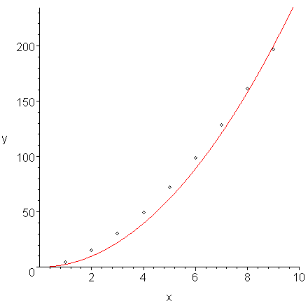
Figure 5. A fit of a least-squares quadratic curve y = 2.472x2 to the data in Figure 3.
Example 3
The following data is known to come from a discharging capacitor together with a loop containing a resistor. We are sampling periodically, that is, once every second.
(5, 0.05336), (6, 0.03179), (7, 0.01889), (8, 0.01123), (9, 0.00666),
(10, 0.00396)
This data is shown in Figure 6.
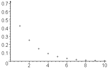
Figure 6. The given data points.
Taking the natural logarithm (the log function in Matlab) of each of the y values, we get the data:
(5, -2.93069), (6, -3.44852), (7, -3.96897), (8, -4.48958), (9, -5.01201),
(10, -5.53148)
Let us denote the logarithm of each of the y values by the vector φ = (-0.33315, -0.85352, ..., -5.53148)T.
If you plot this data, you will note that it does appear to be approximately linear and decreasing. This is shown in Figure 7.
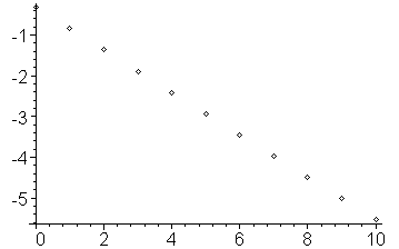
Figure 7. The given data points.
Thus, we should be able to fit a curve of the form c1x + c2 to the data. We may now define the general Vandermonde matrix
and therefore, solving VTVc = VTφ, for the coefficient vector c we get:
c = (-0.51986, -0.33131)T
and therefore, the best fitting line through the logarithmic data is -0.51986x - 0.33131, as can be seen in Figure 8.
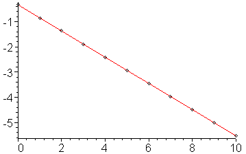
Figure 8. The least squares line which passes through the logarithms of the y values.
Therefore the best fitting line through the original is e-0.51986x - 0.33131 = e-0.51986xe- 0.33131 = 0.71798 e-0.51986x. The original data and this curve are shown in Figure 9.
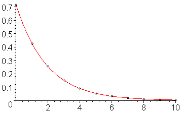
Figure 9. The least squares line which passes through the logarithms of the y values.
Note that while the line appears to go exactly through the points, if you explicitly calculate the y values on the line, you will see that they are only approximately equal (in this case, to about two decimal digits).
Copyright ©2005 by Douglas Wilhelm Harder. All rights reserved.
