- ECE Home
- Undergraduate Studies
- My Home
- Presentations
- Guidelines

Benjamin Disraeli
Statistics is a powerful tool: for those who understand it, statistics may be used to summarize large volumes of data; while those who do not, statistics are a mystery. Because statistics describes trends in data, it can be used to hide anomalies or undesirable facts.
The arithmetic mean, or just mean, of a set of data points is the sum of the points divided by the number of points. For example, the mean of x1, ..., xn is (x1 + ··· + xn)/n.
The mean, however, is not sufficient to describe data. Consider the following two sets of data:
1.8358, 1.8205, 2.0564, 1.9592, 2.1248, 1.8971, 2.1991, 1.7481, 1.9746, 2.0844
-0.4037, 1.4459, 4.0992, 1.1313, 2.3393, 2.1313, 1.6967, 2.5484, 2.6982, 2.0136
Both sets of data have a mean of approximately 1, however, the characteristics of the second set of data is very different: the first set of data are all positive and span the range [1.7946, 2.1991] while the second contains negative values and is spread across the significantly larger range [−0.4037, 4.0992].
To describe the dispersion of a set of data, one can use the standard deviation. In the above example, the standard deviations of the two sets of data are 0.1386 and 1.1068 respectively.
Consequently, it is often a good idea to report the mean and standard deviation together, in this case 1.970 ± 0.1386 and 1.970 ± 1.1068, respectively.
Unfortunately, this is still insufficient to properly describe data, as the following data also has a mean and standard deviation equal to the first set of data:
0.8968, 0.9273, 1.4052, 0.9175, 0.9796, 0.9630, 0.9376, 1.0001, 1.0178, 0.9550
It would be difficult to suggest that these two sets of data have the same characteristics, even if the mean and standard deviation are the same. In the second case, the data is said to be skewed to the left.
All three sets of data are shown in Figure 1 together with the means and one standard deviation marked using [ + ].
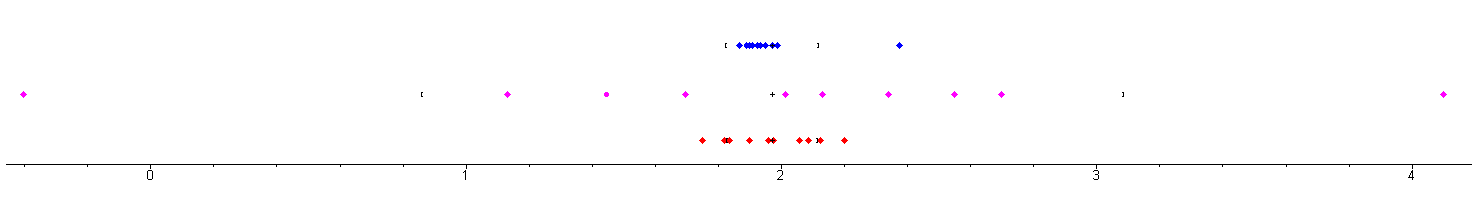
Figure 1. Data sets.
The term average is not equivalent to the mean. An average is a description of the central tendency of a set of data, however, both the median and the mode are also averages.
An excellent book to read is Darrell Huff's How to Lie with Statistics. Shown in Figure 2, this is an excellent read: it is only approximately 100 pages, it was written in 1956, it is still very relevant (the pictures will be out-of-date, but many current applications will quickly spring to mind), and the cost is less than $20.
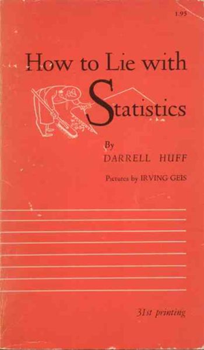
Figure 2. How to Lie with Statistics
Consider the popular and oft-used image shown in Figure 3. Here we see that the the proportion of Federal Subsidies for Meat and Dairy are relatively greater than percent recommended intake.
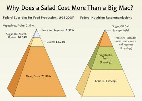
Figure 3. A blatant mis-use of statistics.
First there are the obvious biases: both pyramids contain the word Federal, however, while State subsidies may affect the proportions of the left pyramid, the right pyramid would remain unchanged (State recommended intakes do not affect Federal values).
However, there is a significantly greater disparity in the image: the author used the proportions to specify the heights of the various sections, e.g., the Meat, Dairy section is 73.80% the height of the pyramid. Unfortunately, the pyramid is therefore used to magnify those features which the author wishes to emphasize and diminish those features which the author wishes to marginalize.
Consider the three images in Figure 4. In each case, the yellow portion is used to denote 25% and the red portion is used to denote 75%. This is done by dividing in the z-axis into the proportions of 75% and 25%.
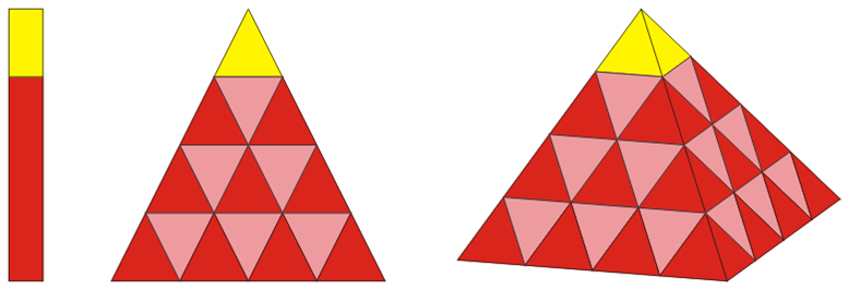
Figure 4. Various means of diminishing 25% and emphasizing 75%.
In the one-dimensional figure, the 75% and 25% sections take up, relatively, the same proportions, however, in the two-dimensional figure, the yellow section takes up 6.25% of the area while the red portion takes up 93.75% of the area. In the three-dimensional figure, the yellow portion takes up only 1.5625% (= 1/64) of the volume while the red proportion takes up 98.4375% (= 63/64) of the volume.
Under no circumstances could this be considered representative of the actual data. While the presentation claims to show a ratio of 1:3, in reality, it gives two objects which have a relative volume of 1:63. A more honest comparison is shown in Figure 5. What is most unfortunate about this is that there is a clear discrepancy between the two, however, it was unnecessary to use the pyramid to amplify the difference.
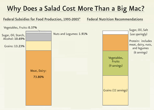
Figure 5. A valid comparison of subsidies versus recommended intake.
One wonders why the authors of the image did not choose the reverse order on the pyramids, as is shown in Figure 6. Unfortunately, one would strongly suspect that this would not support the original intention of the authors, as this would suggest that an apparent 42% (27/64) of the subsidies is used to cover an apparent 58% (37/64) of the recommended intake for meat but an apparent 25% of the subsidies are for grain which are only an apparent 7.6% of the recommended intake.
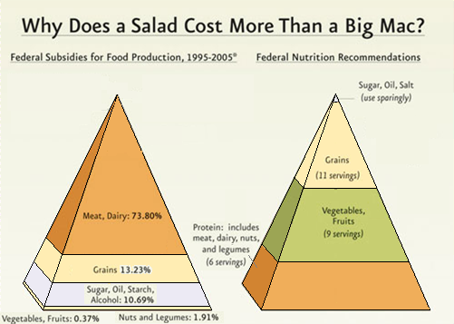
Figure 6. A reversal of the image in Figure 3.
In the previous topic, there was a slide showing the relationship between the mid-term examination and final examination grades. There appears to be a strong correlation between the two. The best-fitting curve is F = 8.2 + 0.90M, but the correlation is 0.79. This indicates that there is a very strong relationship between the two variables.