- ECE Home
- Undergraduate Studies
- My Home
- Presentations
- Guidelines

A single datum point is zero dimensional while a list of data is one dimensional. A default table allows the presentation of data in a two-dimensional format. Unlike graphs where the dimensions are indexed by continuous values, the rows and columns of a table are usually indexed by discrete characteristics. For example, Figure 1 shows a table indexed by elements and their properties.
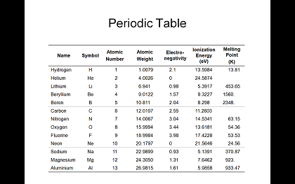
Figure 1. The first thirteen elements and their properties.
You will notice that the titles of each column are centred and bold. Units are included in the title and numbers are aligned on the decimal point.
A reader familiar with HTML, Word, and PowerPoint will immediately notice something missing in Figure 1: there are almost no lines. The columns are carried entirely by the values while the only grouping of the rows are into groups of five with fainter grey lines to allow the eye to follow the row. An alternate means of grouping the rows is with shading as is shown in Figure 2.
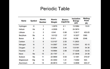
Figure 2. The first thirteen elements and their properties.
Unless there is a more natural grouping of the rows, this author would recommend using groups of five rows. This allows the eye to easily differentiate the individual rows within each group by whether they are on the outside, inset by one, or the centre row. Using significantly larger groupings would make it more difficult to follow the individual rows across the table.
Many of these recommendations for tables are given by Edward R. Tufte in his books on the visual presentation of data. These books are strongly recommended to anyone who wishes to understand both the science and the art of presenting data.
To compare, Figure 3 shows the default style of a table in HTML, Microsoft Word, and PowerPoint.
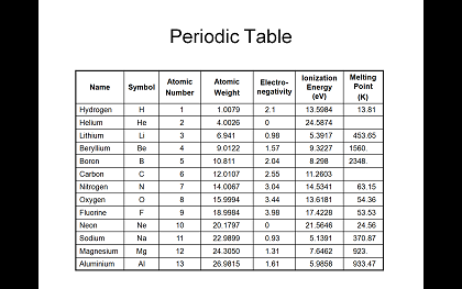
Figure 3. The first thirteen elements and their properties.
The dominant feature in these tables are the borders: the number of line segments is more than twice the number of data points. The eye now not only focuses on the data, but also on the intersections of the lines. The most outstanding feature of the table is the table itself. Tufte would refer to the extra lines as chartjunk: visual elements which do not carry any information.
Unfortunately, the most recent version of PowerPoint gives the user additional chartjunk in the form of colours (as shown in Figure 4) and other embellishments such as shadows and bevels (as shown in Figure 5). For the speaker who has nothing of value to present, these features are certain to capture the attention of those who don't care.
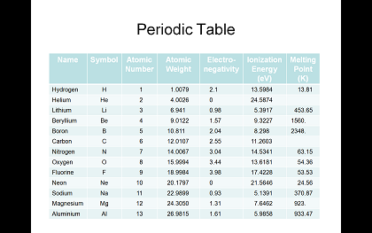
Figure 4. The first thirteen elements and their properties.
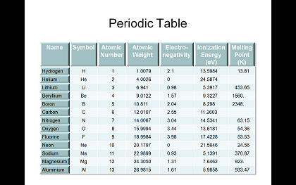
Figure 5. The first thirteen elements and their properties.
Compare how smoothly the eye can follow a single column in Figures 1 or 2 and how distracted the eye is when following the columns in Figures 3, 4, or 5. It is more likely that they eye will stray and follow the lines as opposed to the data. The softer borders in Figure 4 are significantly kinder to the eye than the harsh lines in Figure 3 but are they even needed at all?
While a table is two-dimensional, it is possible to include a third, and possibly even a fourth dimension in the presentation, although the latter will almost certainly introduce more obfuscation than it would additional information.
While the author does not currently have access to the relevant data, Figure 6 shows how the additional dimension of time may be included in a table. For clarity, this has required the introduction of additional lines to separate the properties being mapped over time. In addition, the values in the third dimension are maintained across both atomic weights and ionization energies. Normally, a graph would be more appropriate for numeric data; however, in this case, the focus is the progression of the precision of the data and not the actual values themselves.
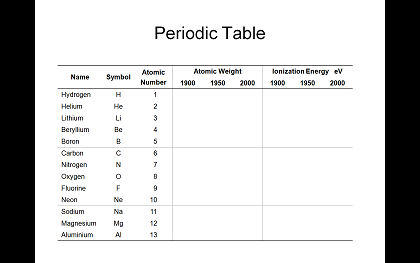
Figure 6. Accuracy of properties of elements over time.
However, even in this case, a more appropriate representation may be to plot the error relative to the most recent value. Additionally, the standard deviation may also be more useful in such a presentation.
A PowerPoint presentation which contains the tables displayed above may be downloaded here.
Tables should be used to present data in two or possibly three dimensions where both dimensions are characterized by discrete values and different values may have different units. Where possible, use an appropriate chart or graph and only revert to a table where the former two cannot clearly display the point the speaker wishes to make. Finally, lines and colours are chartjunk: avoid them were they do not add useful information. A speaker who feels that his or her data needs embelishments and chartjunk to maintain the interest of the audience should ask themselves if they have anything to present at all.